






COMMON SENSE MEDIA
[][][][][][][][][][][][][][][][][][][][][][][][][][][][][][][][][][][][][][][]
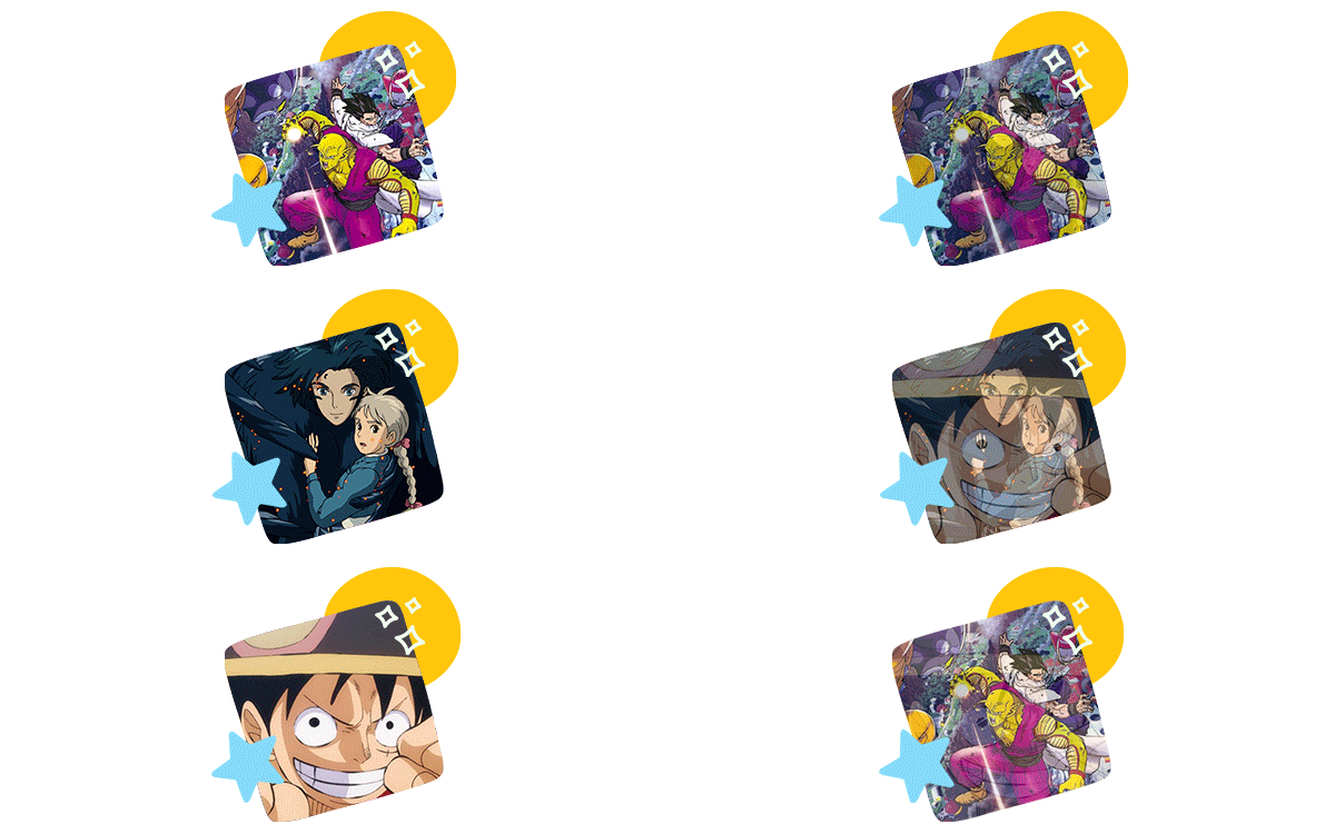
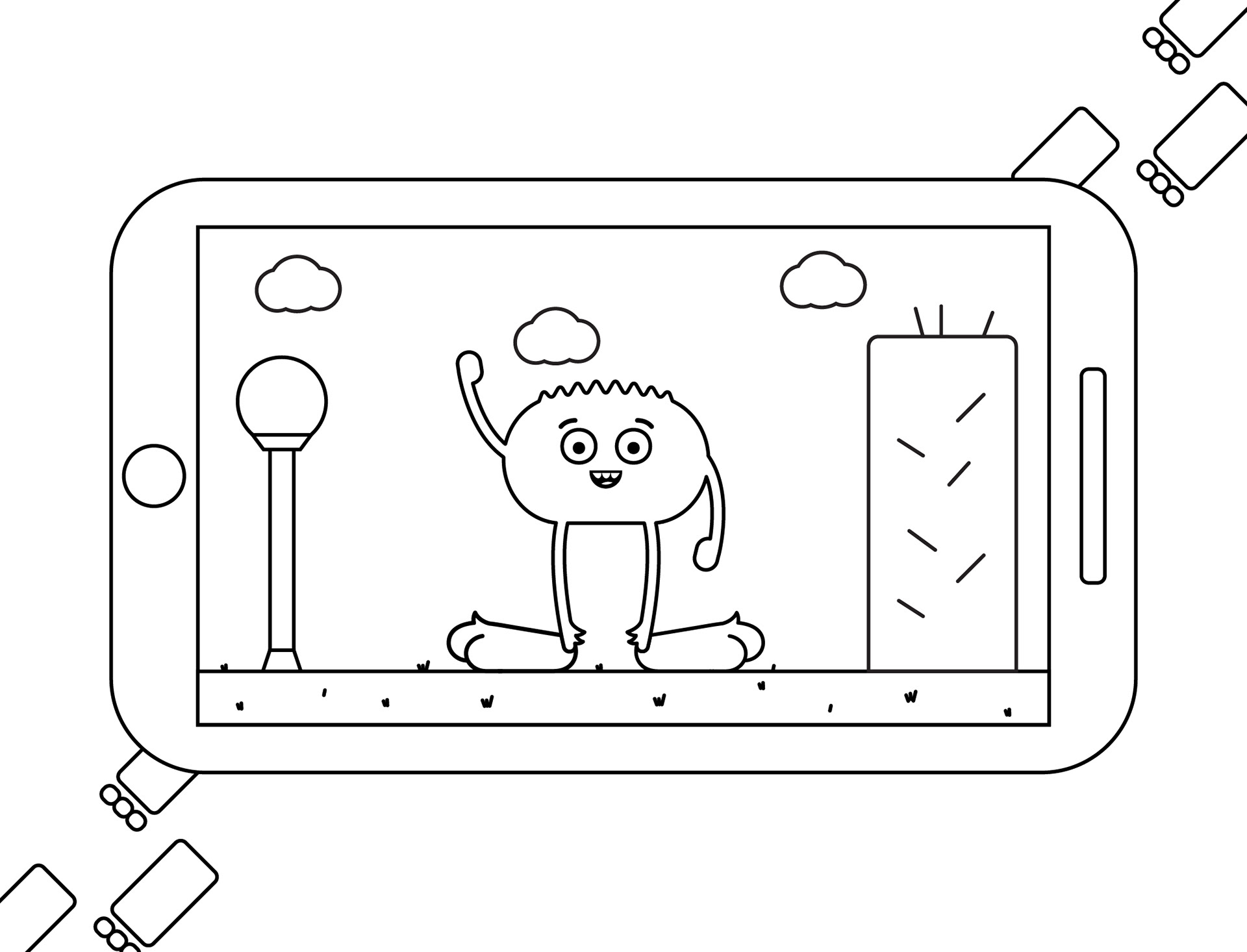
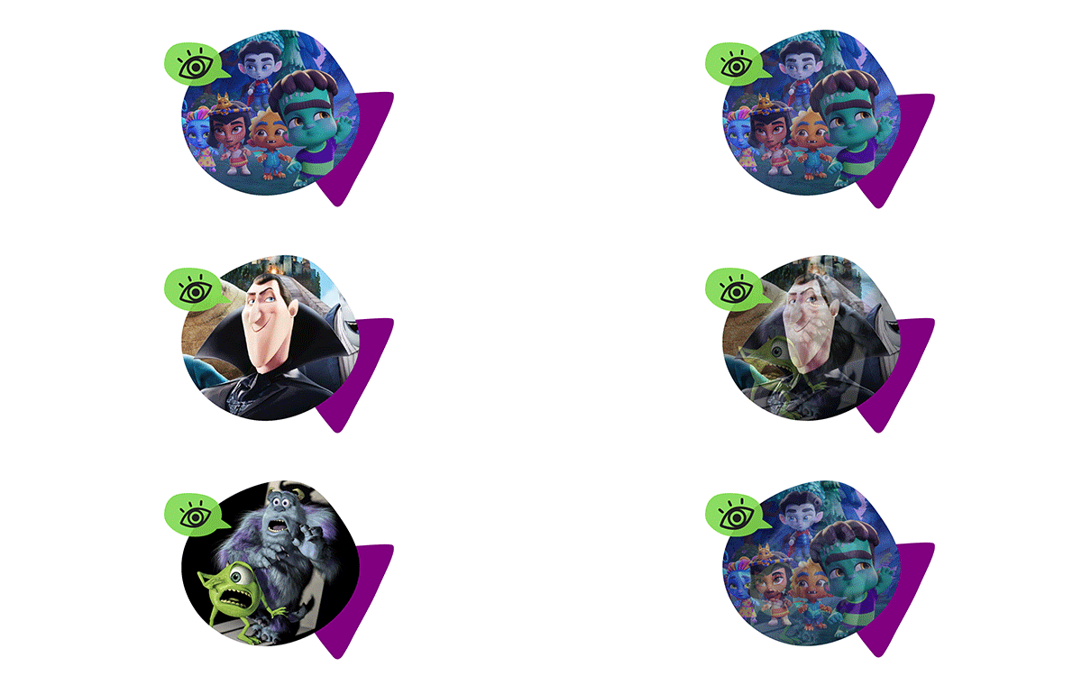
Common Sense Media is a non-profit
organization that pushes for child advocacy
through different forms of media. Projects
mostly included images for weekly newsletters,
social media posts, educational publications,
and print. These projects involved a lot of
animating and creating motion graphics.
VICTORIA, ARGENTINE KITCHEN
[][][][][][][][][][][][][][][][][][][][][][][][][][][][][][][][][][][][][][][][][][][][][][][][][][][][][][]
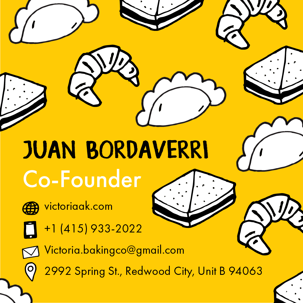
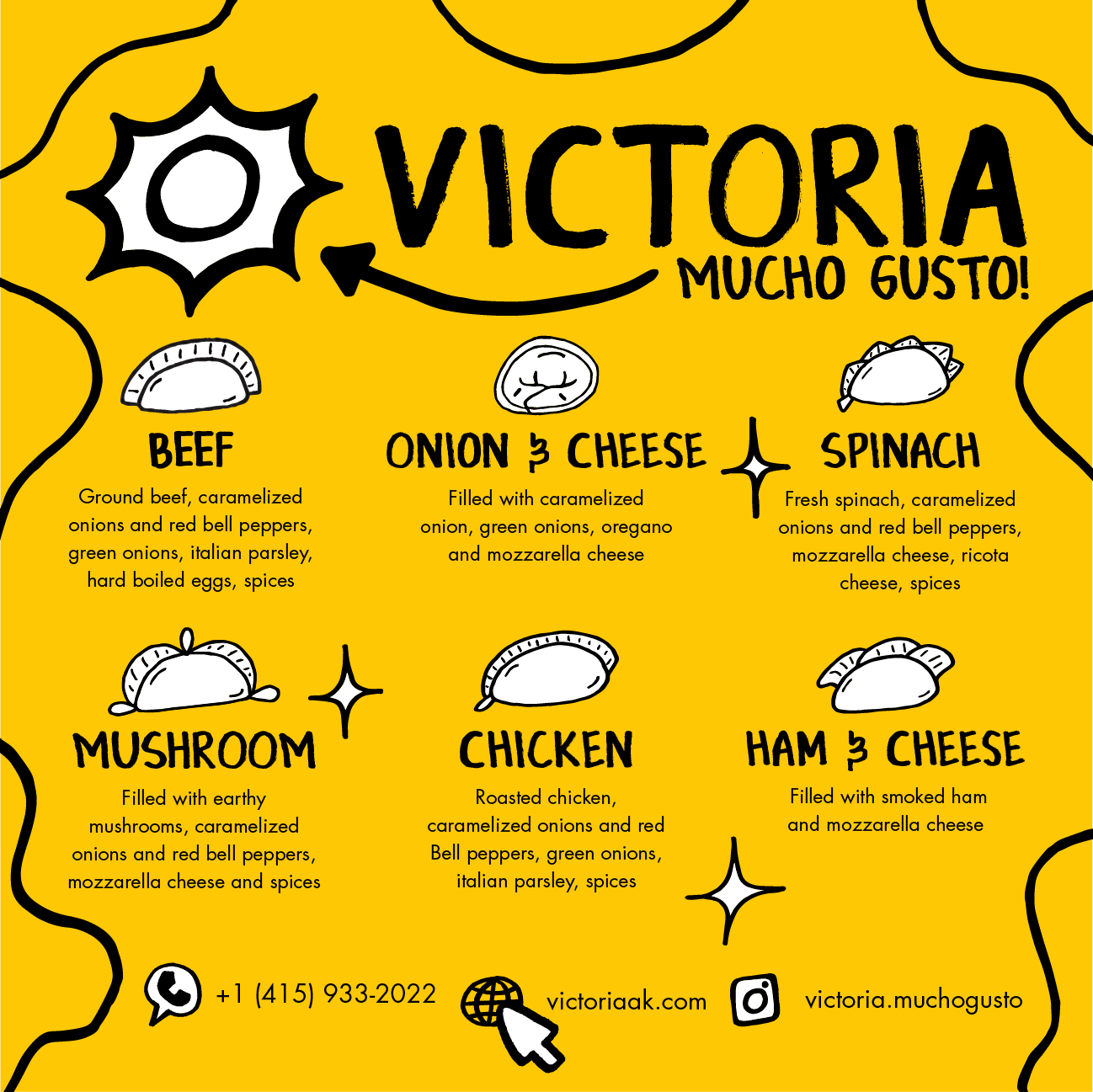
Victoria, Argentine Kitchen is a local restaurant that
specializes in Argentine cuisine such as empanadas,
pastries, & sandwiches. I created the company's
identity, brand, & logo. I created their website &
helped with their social media page. I also created
printed assets, including packaging, stickers, &
business cards. All illustrations are hand drawn by
me. I handled translating & creating assets in both
English & Spanish. I love to promote my culture.












BOECKMAN PRIMARY SCHOOL
[][][][][][][][][][][][][][][][][][][][][][][][][][][][][][][][][][][][][][][][][][][][][][][][][][][]
Boeckman Creek Primary is a local school in
Wilsonville, OR. I worked alongside a creative
director to redesign this school's mascot. Using my
illustration and her guidance, we've created a lovable
character that children will remember for years. I took
a lot of inspiration from vintage university mascots.
While a lot of them were ferocious animals, they
were made to look approachable and proud.
Mascots these days tend to lack personality,
so I figured this approach would give kids a
more fond memory of their early school years.
BAIRES CONSTRUCTION INC.
[][][][][][][][][][][][][][][][][][][][][][][][][][][][][][][][][][][][][][][][][][][][][][][][][]
Baires Construction Inc. is a contracting company
that mainly works in the Bay Area but has also worked
internationally. They've been around for over 20 years.
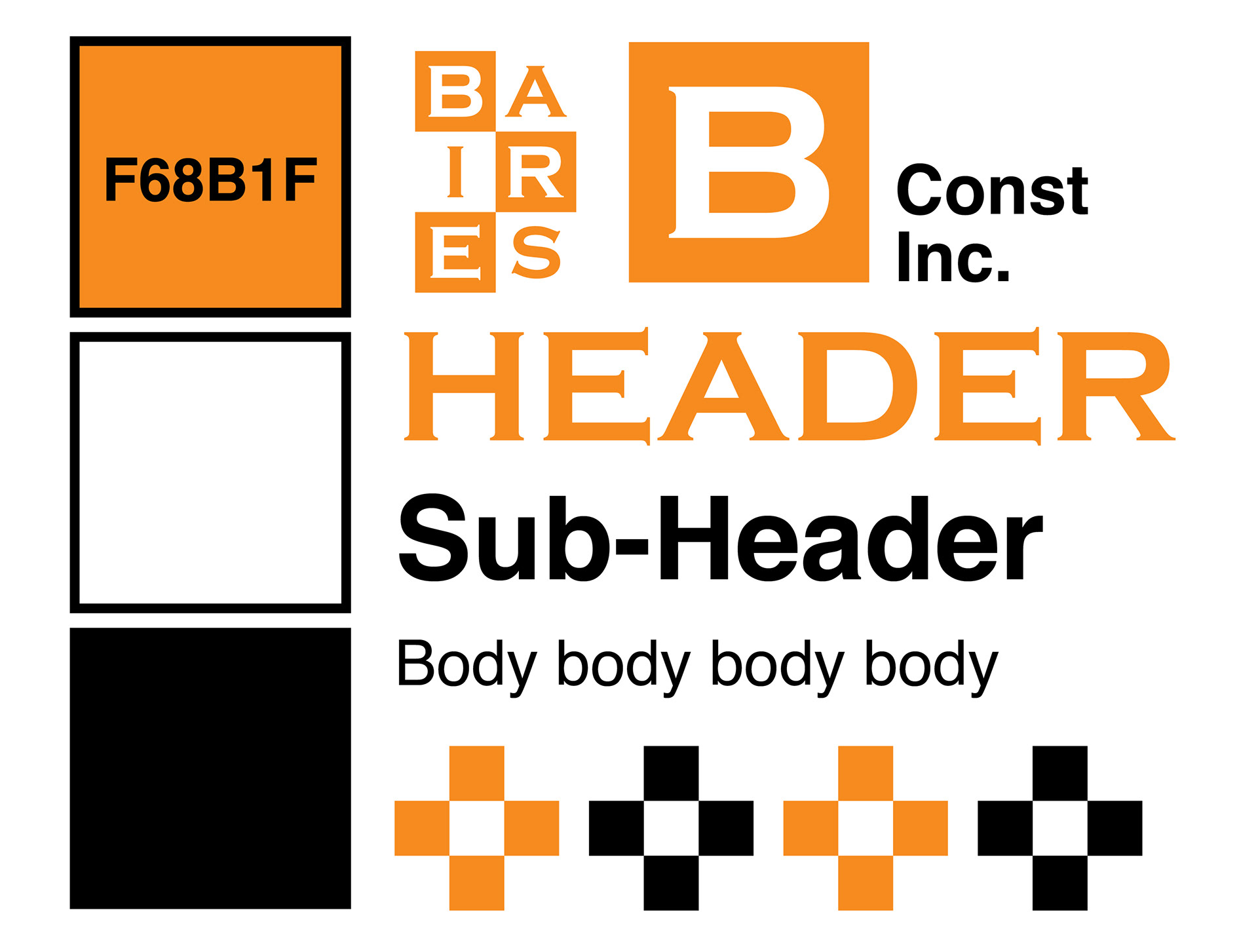
I rebranded Baires by creating a new identity, logo, website
& business cards. I wanted to create a brand that represented
a sturdy foundation while using "hazardous" colors that
caught the attention of viewers. The strength lies in the
simplicity of bold elements within an organized display.



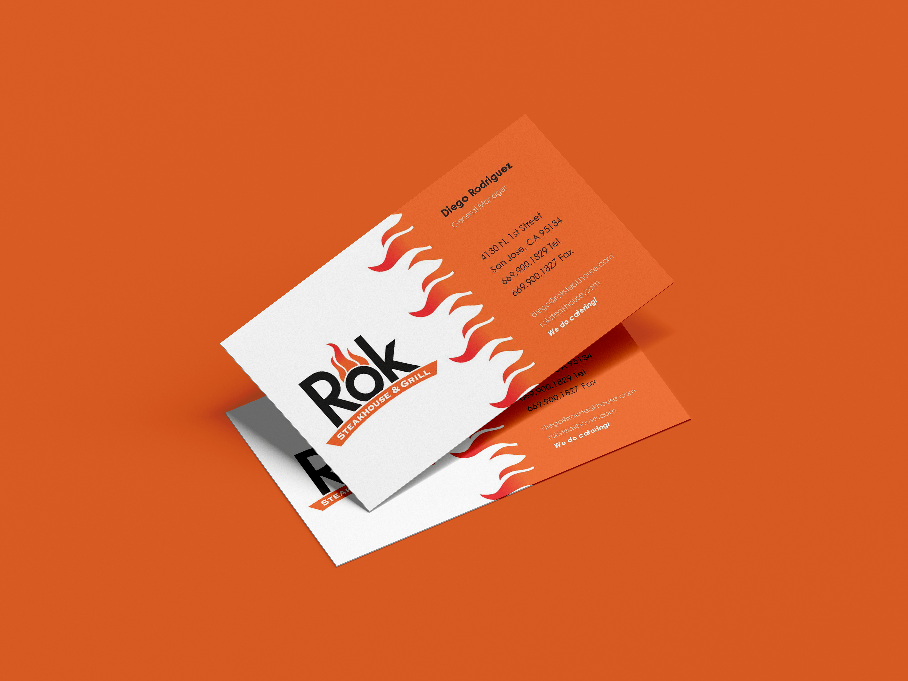
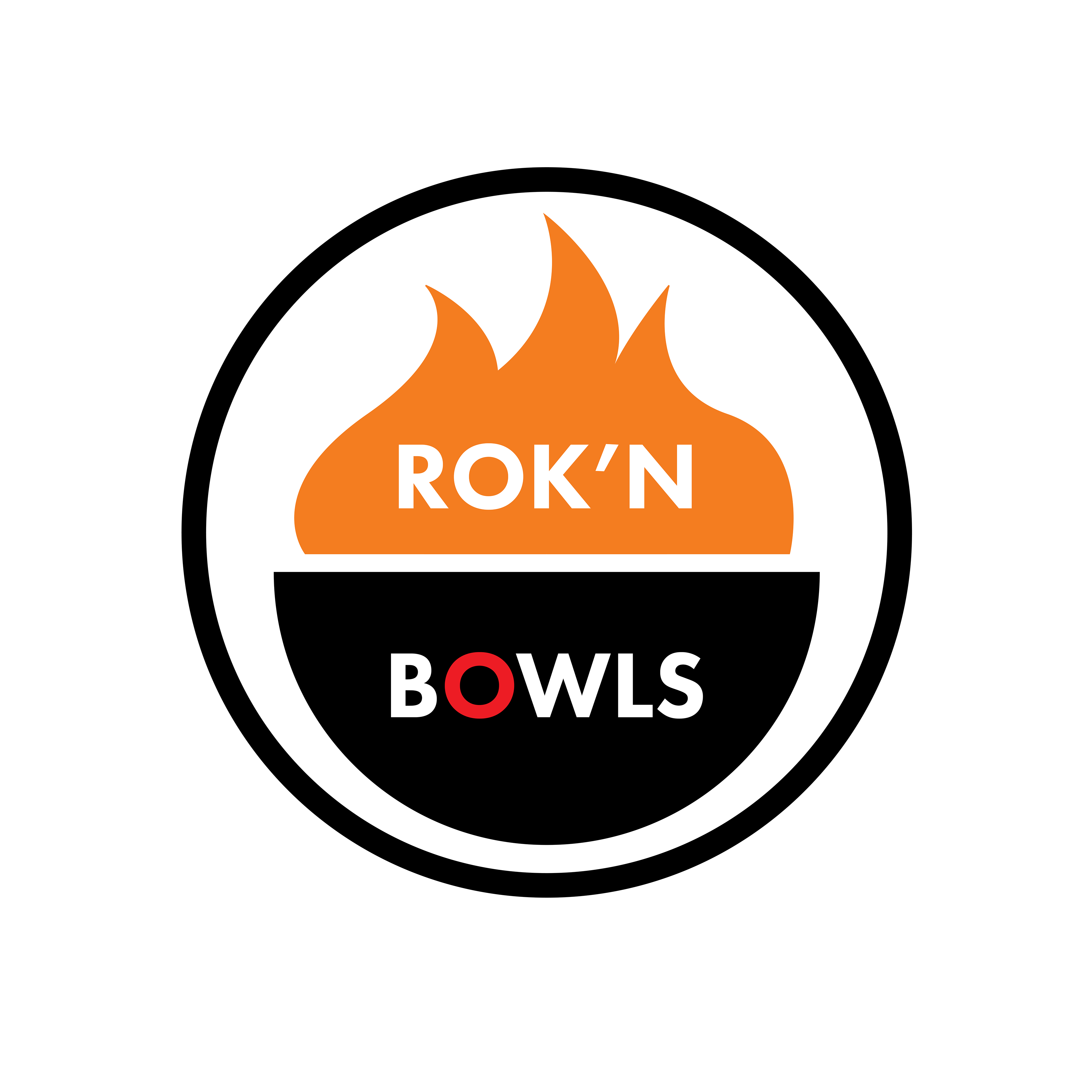
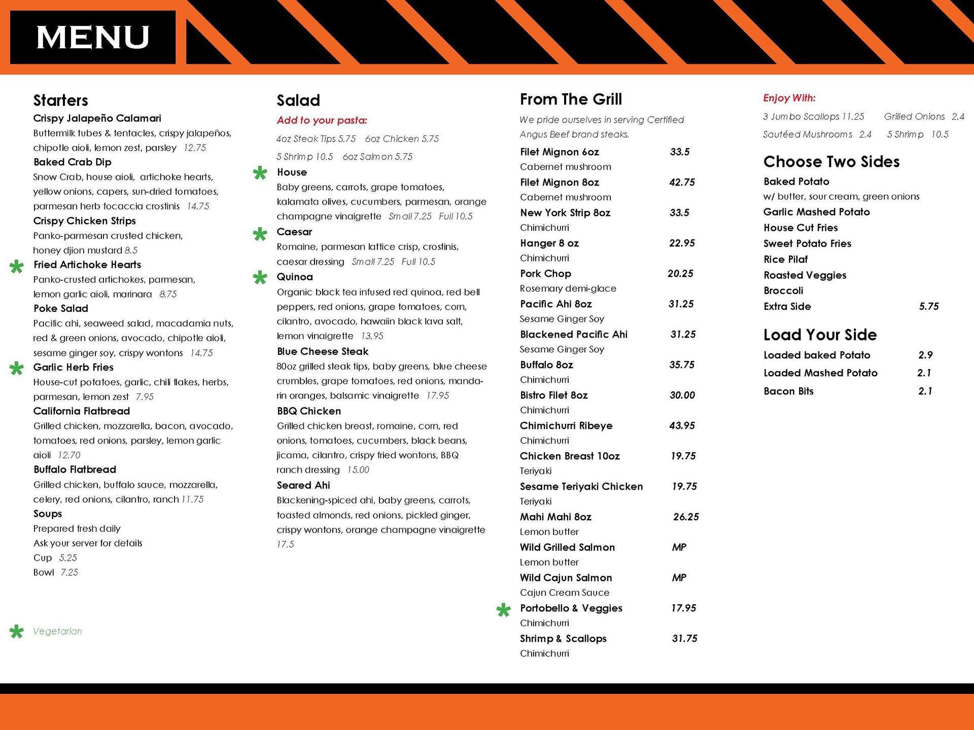
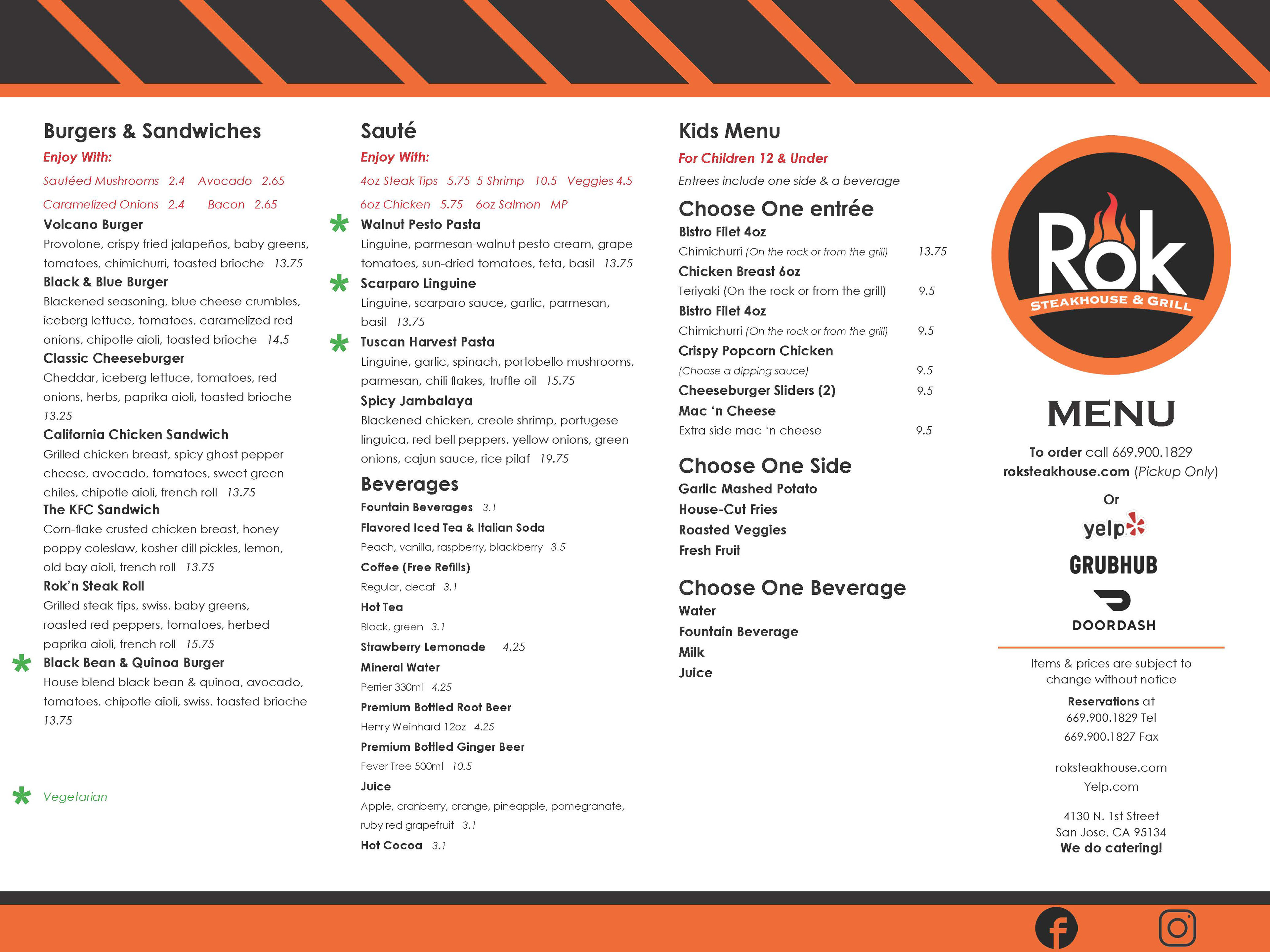
ROK STEAKHOUSE & GRILL
[][][][][][][][][][][][][][][][][][][][][][][][][][][][][][][][][][][][][][][][][][][][][][]
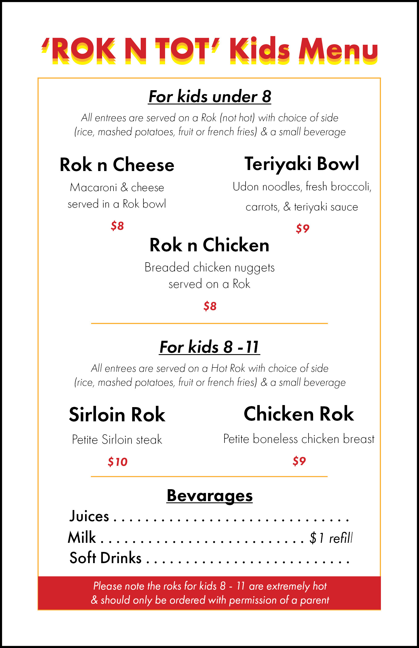
Rok Steakhouse/Bistro were sister locations for
Rok restaurants. They both specialized in steakhouses
served on volcanic rocks & fondue. My work here
included designs for both digital and physical purposes.
Most of the time, I worked on the menus & I spent the
remainder of my time creating signs, other logos,
business cards, and more. I worked within the
brand's guidelines while also pushing the boundaries.
